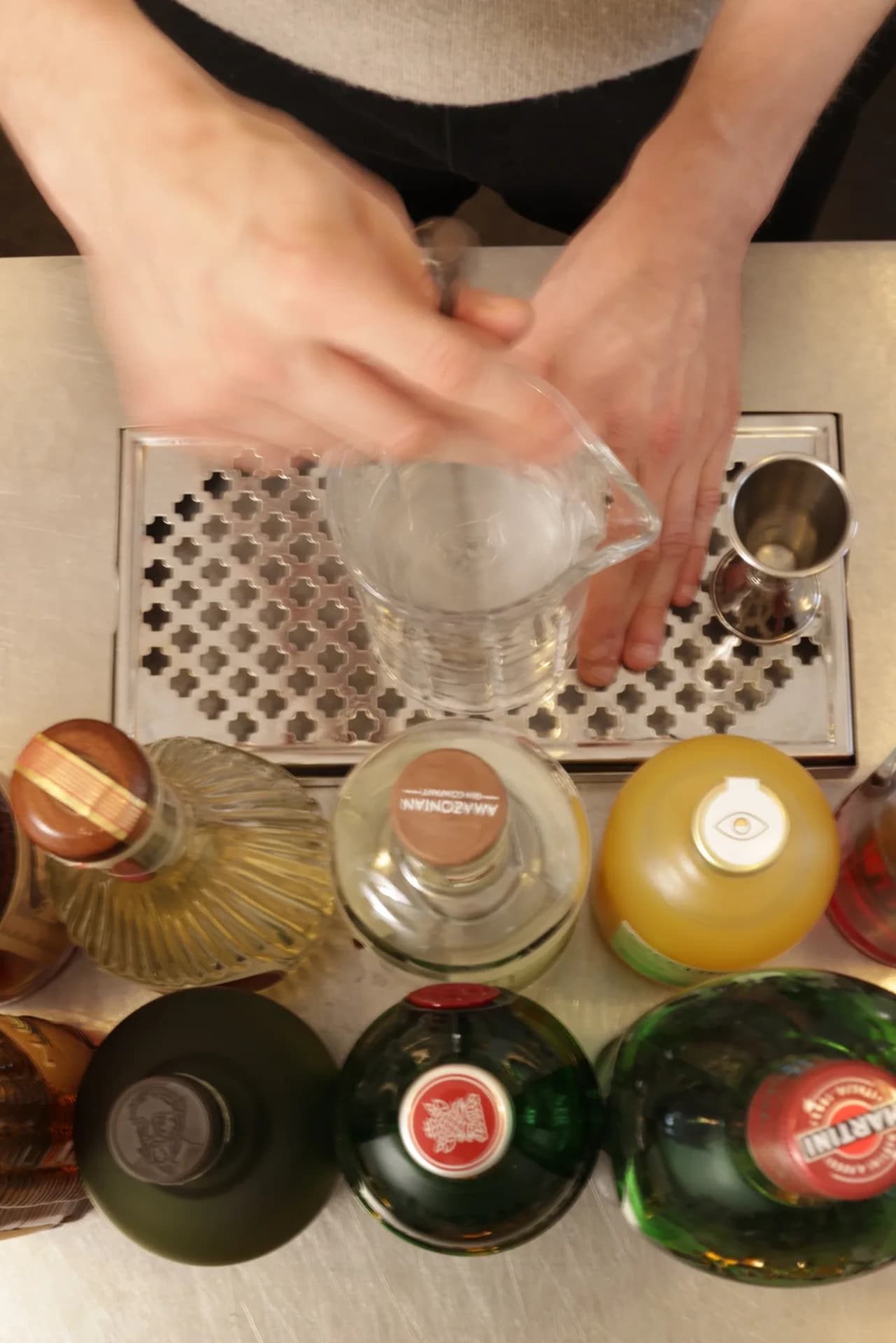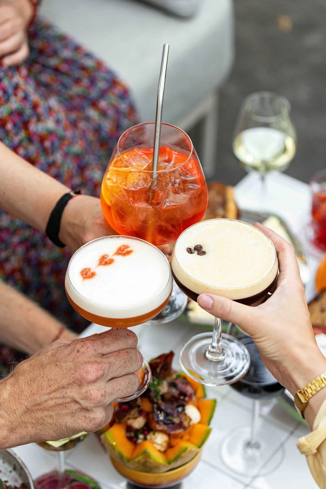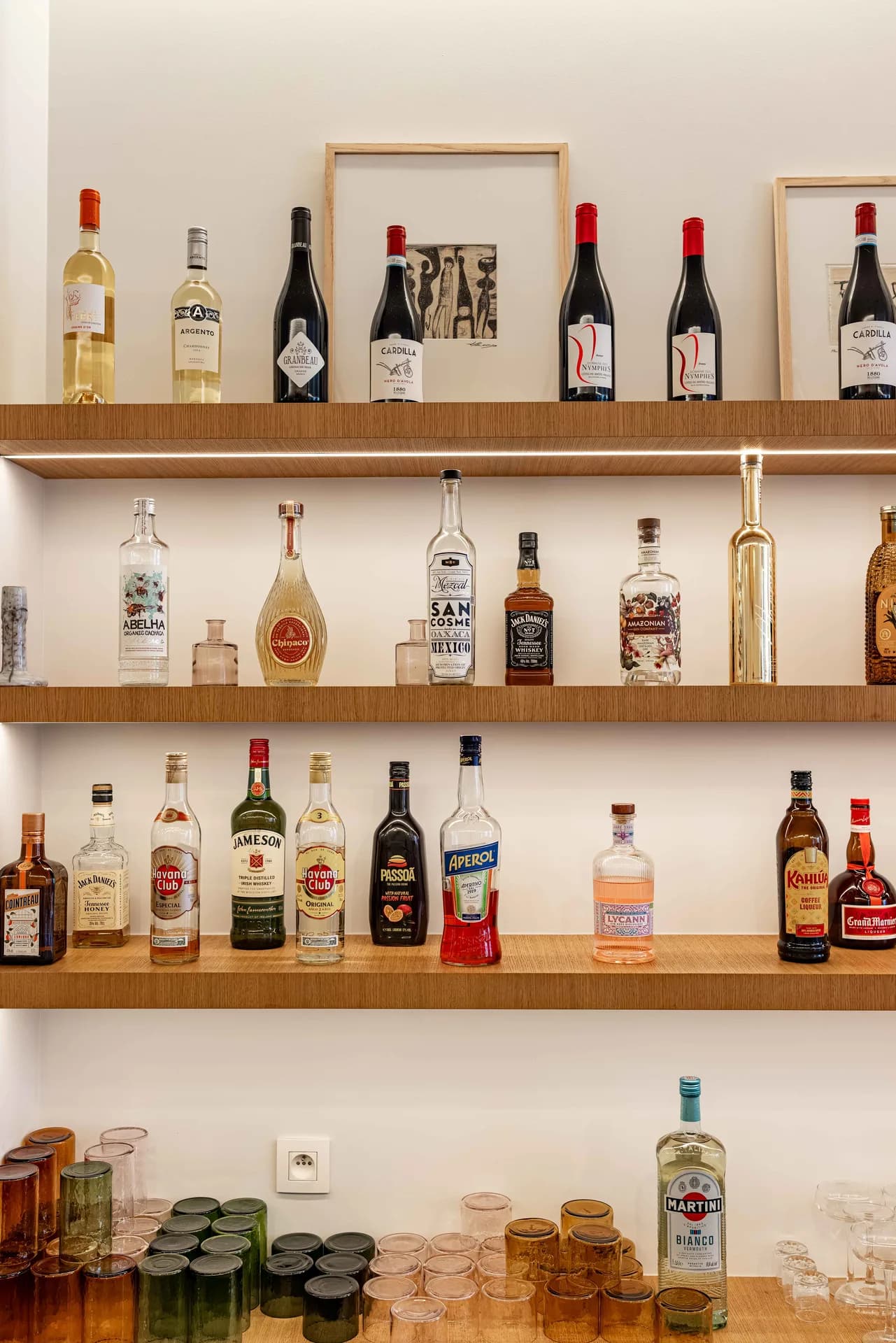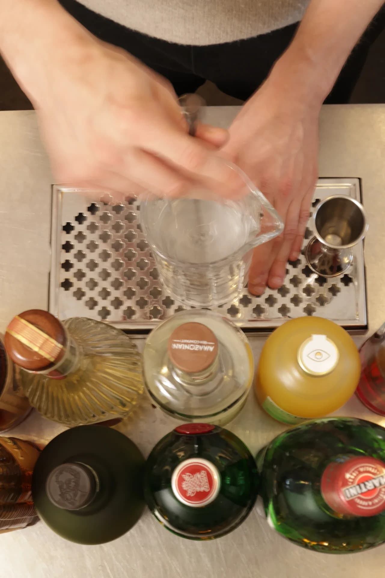
Cocktail preparation photographed from above at Martine.

Hospitality / Restaurant

MARTINE

A visual-identity and content case study showing how Martine’s mark, wordmark, space, food, and service moments belong to one recognisable world.

  • Creative Direction & Branding
  • Content Creation & Social Media

Client overview

Martine

Measurement context / Public Instagram profile snapshot / 15 September 2026

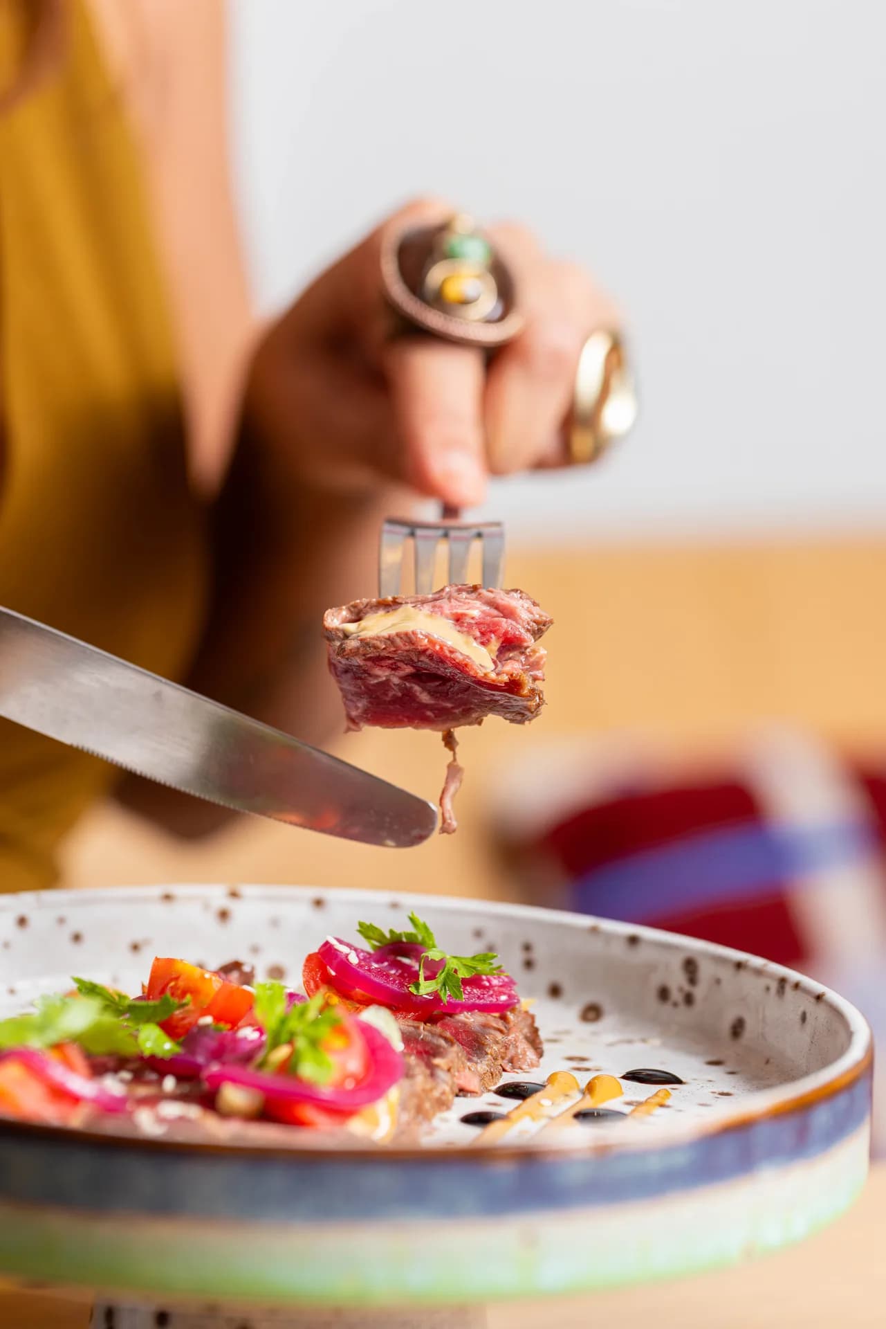
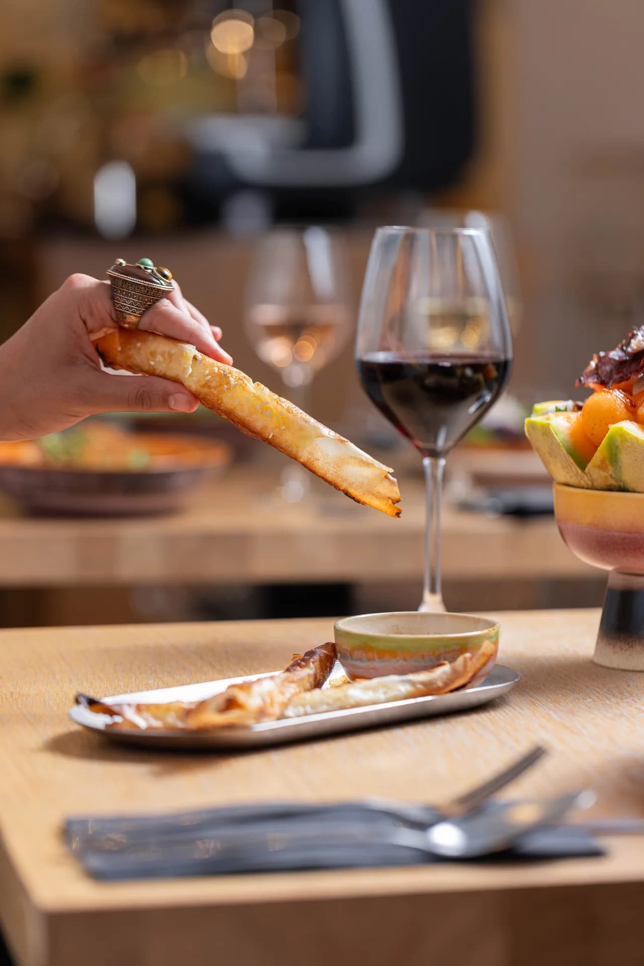
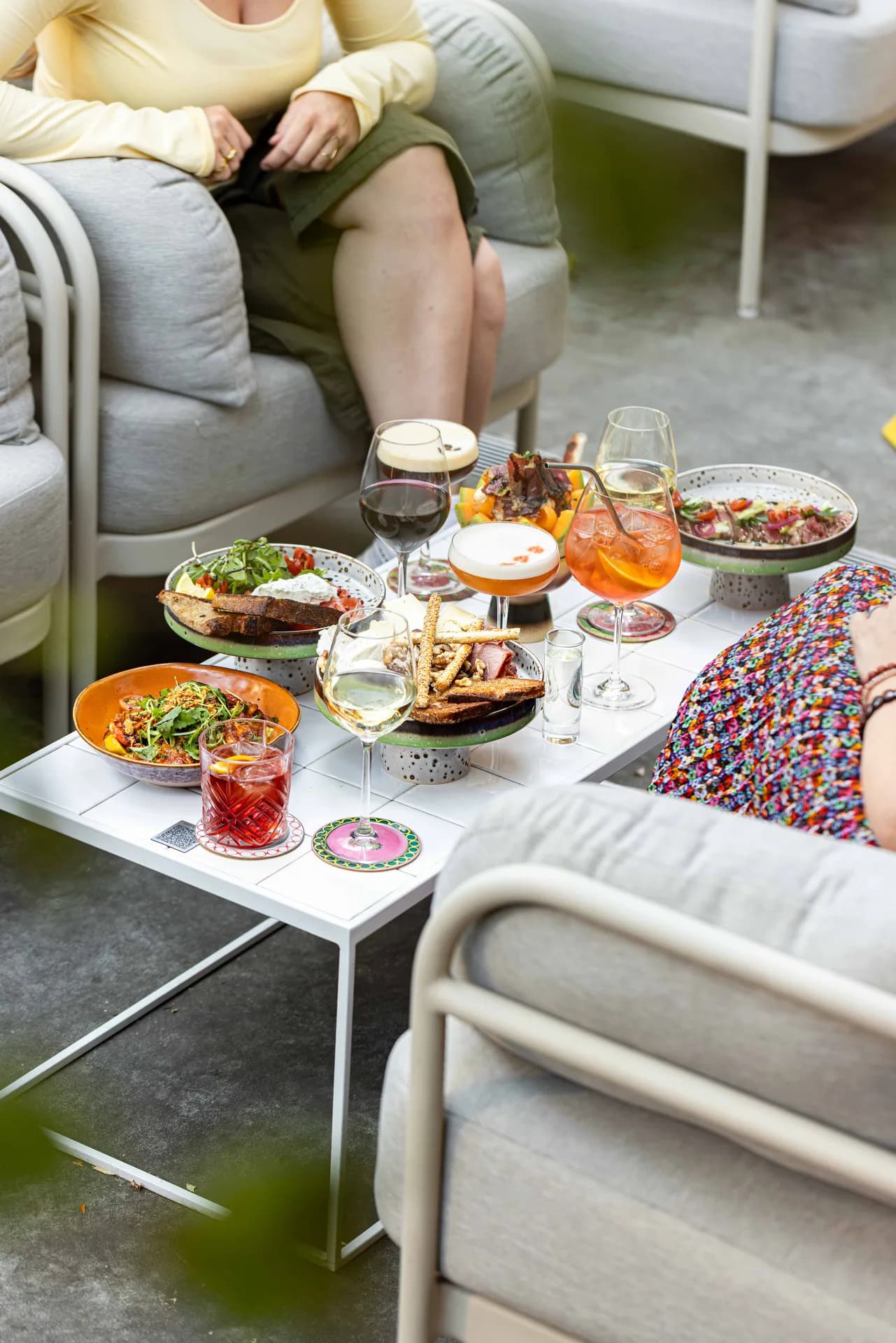
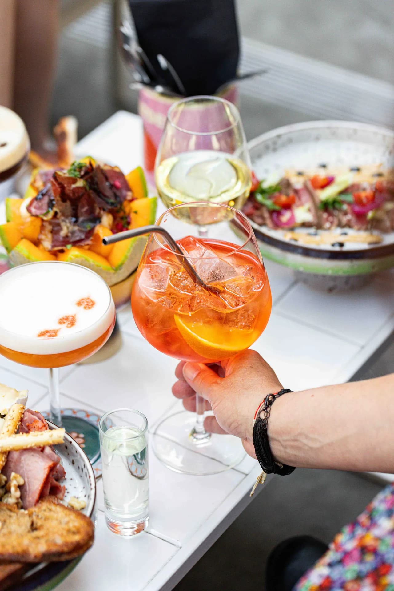
Martine moves between daytime café, lunch, evening wine and tapas, and Sunday brunch. The engagement connects logo and identity development, creative direction, content creation, and social-media handling so the wordmark, space, imagery, and posts feel like expressions of one recognisable hospitality world.

Industry
Hospitality / Restaurant
Services
Creative Direction & Branding / Content Creation & Social Media

Public Instagram snapshot

THE PUBLIC PROFILE, AT A GLANCE.

These are public account totals captured on 15 September 2026. They establish the profile’s current scale, but do not establish growth, reach, engagement, or agency attribution.

  1. 01 / Instagram followers436

    Public total displayed by @martine_brussels on the verification date

  2. 02 / Published posts41

    Public profile total. This is not a measure of work delivered by the agency.

Creative Direction & Branding

A RECOGNISABLE HOSPITALITY IDENTITY.

The logo redesign is one part of Martine’s broader branding system, alongside typography, composition, image treatment, and creative direction.

Brand direction

THE SYSTEM BEYOND THE WORDMARK.

The identity extends through typography, hierarchy, composition, image treatment, and repeated layout decisions. Those relationships let food, drinks, interiors, and service moments vary while still feeling connected to the same Martine personality.

Logo redesign

A WORDMARK BUILT FOR RECOGNITION.

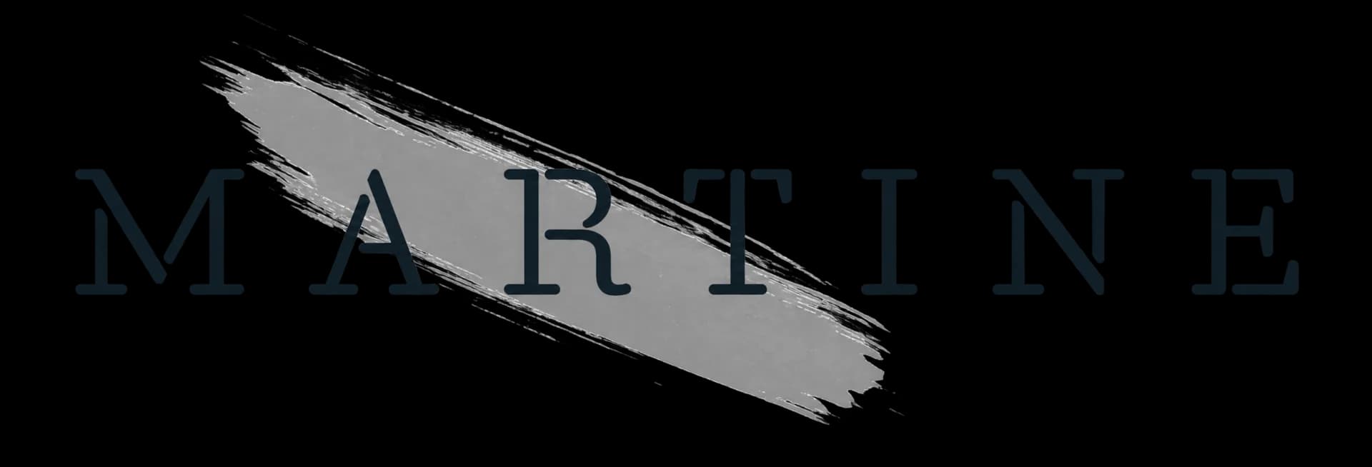
The approved design rationale uses a wide geometric sans serif to create a strong modern presence. Its bold wordmark is intended for immediate recognition and lasting impact, while clean construction keeps the mark direct and legible. Balanced letter rhythm gives the composition stability and visual harmony rather than relying on decorative complexity.

Previous Martine serif wordmark layered over a grey brush stroke.
Redesigned Martine geometric wordmark.

What existeda fine serif wordmark layered over an expressive brush stroke

What changeda wider geometric wordmark with cleaner construction and a steadier rhythm

Creative direction

KEEP EVERY TOUCHPOINT CONNECTED.

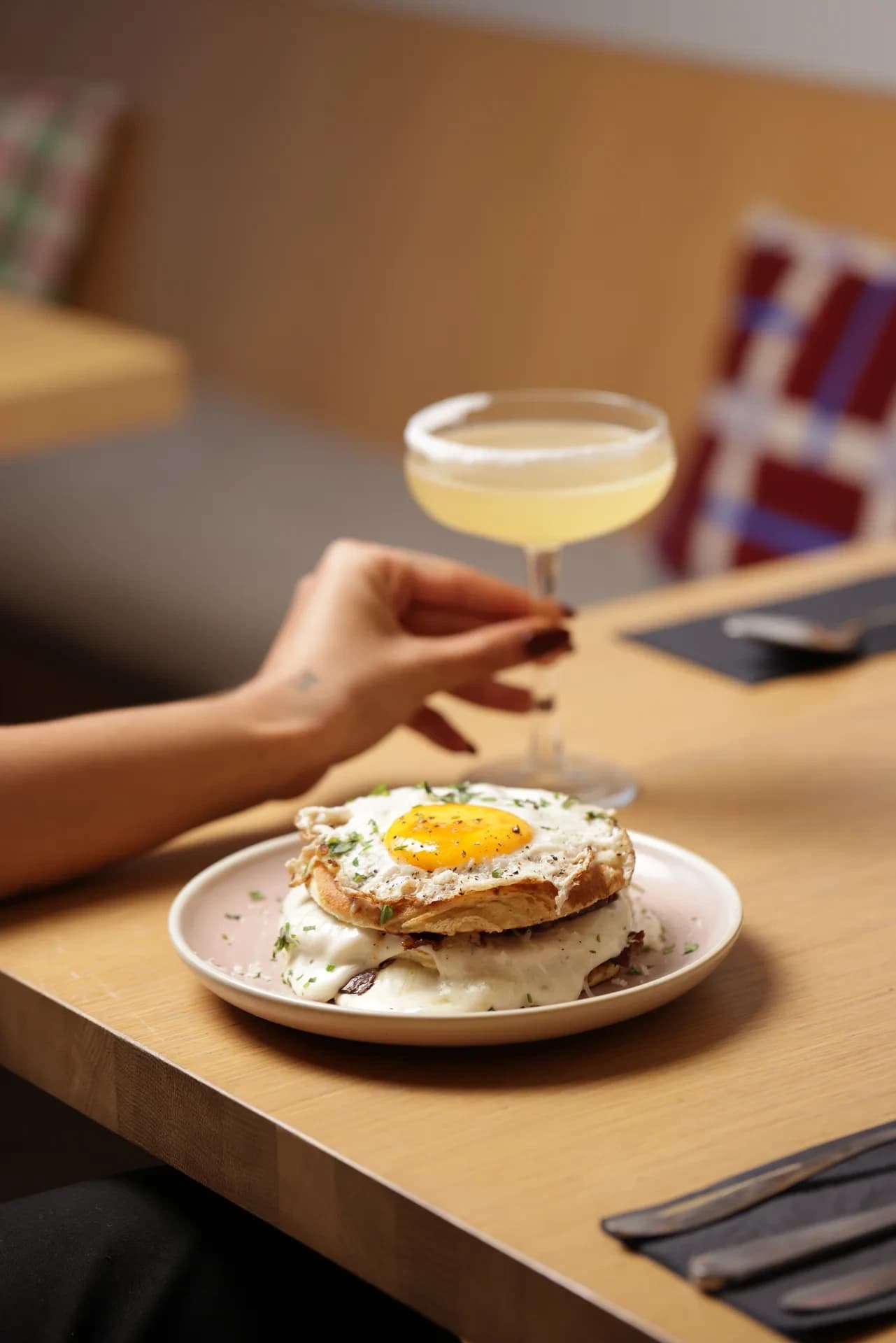
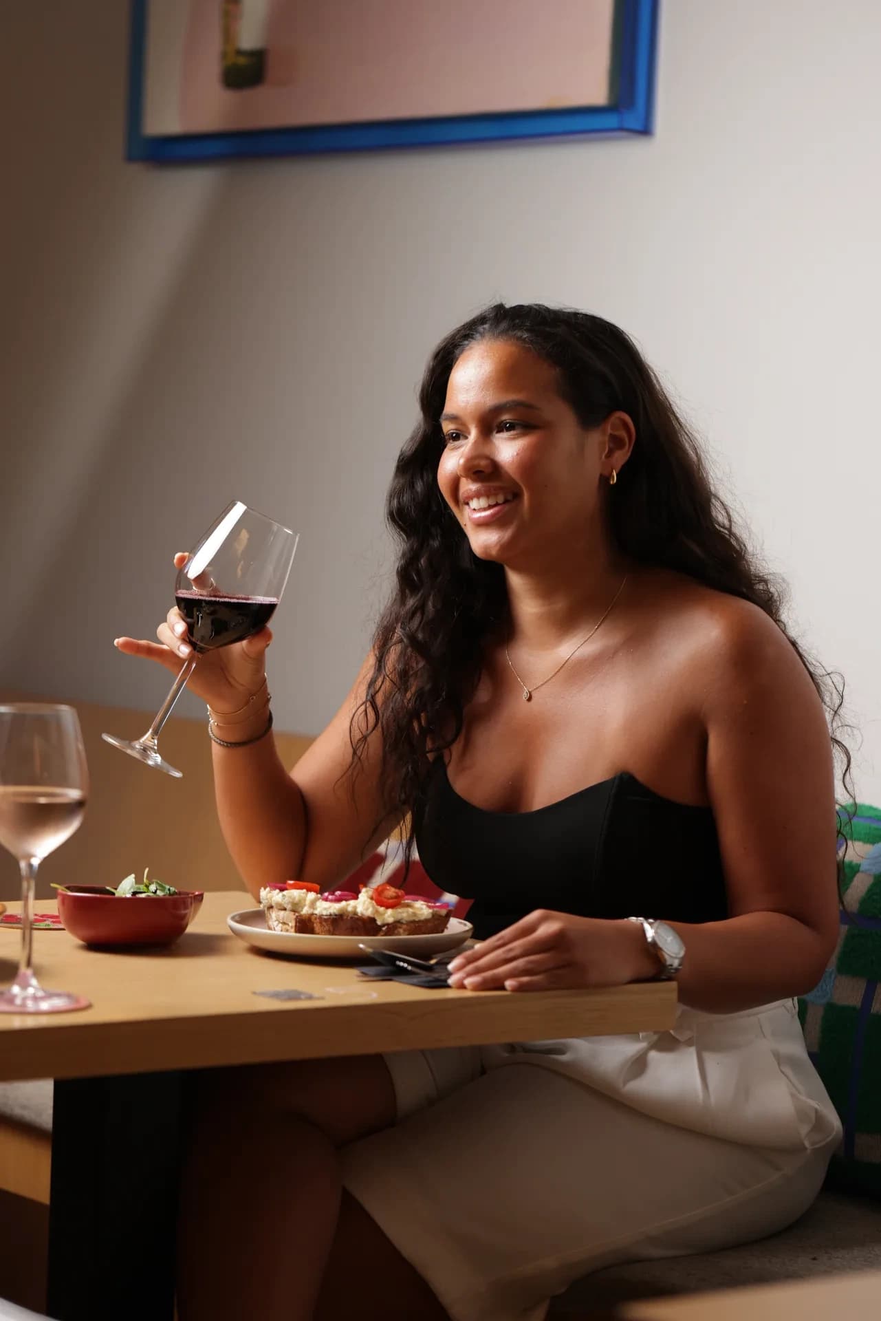
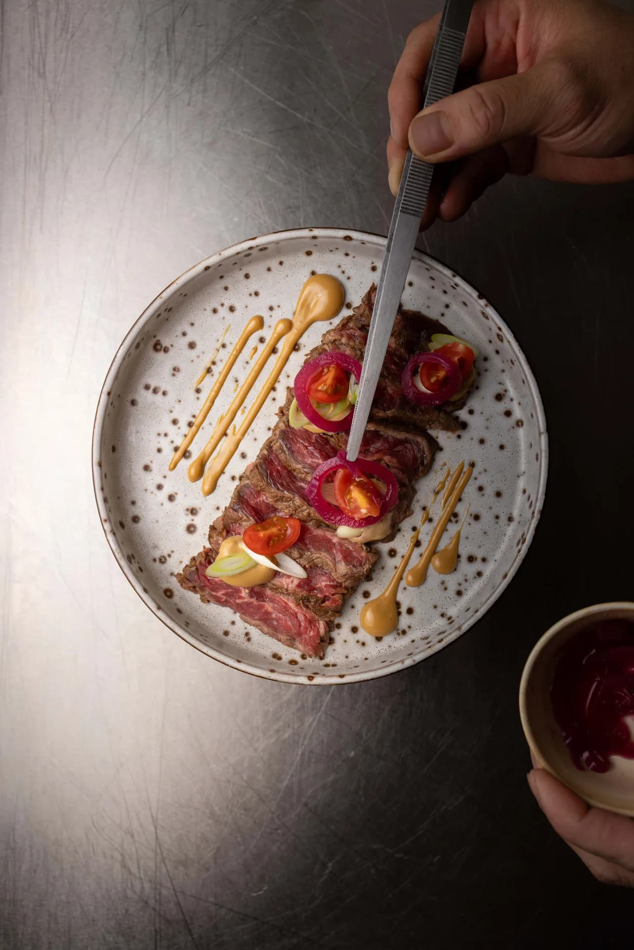
Creative direction carried the identity into real hospitality moments by setting a consistent approach to subject, framing, atmosphere, composition, and selection. The venue, dishes, drinks, people, and service could each have their own character while still contributing to one clear and recognisable brand world.

Content Creation & Social Media

RECOGNISABLE WITHOUT REPETITION.

Consistent hierarchy, framing, type treatment, recurring formats, planning, publishing, account handling, and community management turned the identity into an ongoing social system without making every post identical.

Source and verification

EVIDENCE BEFORE CLAIMS.

The project association is supplied by the research brief. Brand assets are first-party. Public Instagram totals were read from the profile metadata on 15 September 2026. Public agency attribution and Insights-only performance remain unverified.

Your project

READY TO MAKE THE NEXT MOVE?

Start a conversation