
Structure
Gives each page a purpose and arranges information around the questions visitors actually have. Navigation, headings, and calls to action help them move without having to decode the organisation behind the site.
03 / Service detail
What this work is for
For businesses whose website no longer explains the offer clearly, answers the questions visitors bring, or makes the next step easy to take. A site may look polished and still leave people unsure where to begin, what makes the business relevant, or how to get in touch.
We begin with the business goal and the visitor's journey, then give each page a clear role. Content structure, copy priorities, visual design, responsive development, and measurement are planned together so the site works as one experience. The result should be understandable on a phone, accessible through different ways of navigating, and practical for the team to update as the offer changes.
Talk about this serviceThe thinking behind the work
A website is a sequence of decisions for the visitor. They arrive with a question, look for evidence that the offer fits, and need a clear route to enquire, book, buy, or keep learning. We map those moments before polishing individual screens. This helps determine what each page is for, which information deserves priority, and where navigation or calls to action remove friction instead of adding noise.
The visual system then has to work with real content and real constraints. We consider long and short copy, different screen sizes, image crops, forms, loading states, keyboard use, and the ability to maintain the site after launch. A good handover explains how the components should be used, while measurement and feedback identify where the journey still needs improvement. Launch is a quality milestone, not the end of learning.
Content planning belongs at the start, not after the design is approved. We identify which pages must explain the offer, which questions need a direct answer, what proof is available, and where a visitor needs reassurance before contacting the business. Page outlines and content priorities give writing, design, and development a shared structure. They also prevent a polished layout from depending on placeholder text or imagery that the team cannot realistically produce.
The build turns those choices into behaviour: navigation that remains clear on a phone, headings that preserve meaning, forms people can complete, components that handle real content, and pages that load without unnecessary friction. Before launch, we check the important journeys across screen sizes and interaction methods, address issues we find, and make the handover practical for future updates. After launch, agreed measurement and feedback can show where people still hesitate and which improvement is worth making next.
Strategy to interface
A visitor rarely reads a site from beginning to end. They scan, compare, return to a question, and decide whether the next step feels worth taking. Structure, content, design, development, and measurement have to support that behaviour together.
Gives each page a purpose and arranges information around the questions visitors actually have. Navigation, headings, and calls to action help them move without having to decode the organisation behind the site.
Uses art direction, typography, imagery, and interaction to make the offer distinctive without obscuring it. The visual system has to carry real copy, changing images, and different screen sizes while preserving a clear hierarchy.
Treats launch as the start of a measurable experience. We check the journeys that matter, learn where visitors still hesitate, and prioritise refinements rather than assuming the first version has answered every question.
Experience in context
A website has a job beyond looking finished. It must orient a first-time visitor, explain the offer in language they understand, provide credible reasons to trust it, and make the next action easy to find. We consider those questions from a small screen and a large one, with real content rather than idealised placeholders.
Inside the discipline
We map the decisions visitors need to make, then create a hierarchy and journeys that support them.
Website strategy connects the business objective with the visitor's objective. UX and structure translate that relationship into page roles, navigation, content order, and clear routes to action. Before a visual layout is refined, we decide what each page must answer and how someone should move between related information without losing context.
A visually polished site can still lose people when services are described in internal language, several pages repeat the same message, or the next action appears before a visitor has enough confidence to take it. Unclear hierarchy also makes future content harder to place and important pages harder to discover through search.
Review the offer, current site, audience questions, available content, and points where the journey loses clarity. Define page roles, information architecture, navigation, and the order in which essential questions are answered. Outline priority pages and match calls to action to the visitor's level of understanding, then review the route on small and large screens.
We review the existing offer and the questions visitors bring to it, then turn that into page roles, content priorities, and a route through the site. A useful outline shows what someone should understand before the next action is offered. This makes writing, design, development, and SEO decisions easier to evaluate against the same visitor journey.
Site strategy, Information architecture, User journeys, Page outlines, Content priorities, Conversion recommendations.
This work matters when visitors struggle to tell services apart, cannot find a useful answer, or leave without understanding why they should enquire. It is also the right starting point for a new site with several audiences or a growing offer.
A clear structure gives copywriting, visual design, and development a shared brief. It helps SEO by giving each important page a distinct purpose and meaningful links to related content.
Visual design, responsive development, conversion-focused pages, and ongoing improvements informed by real behaviour.
Design gives the agreed structure a recognisable visual language and a clear reading hierarchy. Development makes that language usable through responsive layouts, reusable components, accessible interactions, and reliable forms. Improvement continues the same work after launch by examining whether the live experience helps people complete the journeys it was built for.
A site can look convincing in a static presentation yet struggle with long copy, missing images, small screens, keyboard navigation, slow loading, or a form that is difficult to complete. If launch is treated as the final handoff, those details and later visitor feedback have no clear owner.
Design with real page content and test how typography, imagery, controls, and hierarchy behave across screen sizes. Build reusable components and check important journeys, forms, performance, and accessibility before launch. Prepare a practical handover and use agreed measurement and feedback to prioritise meaningful improvements after release.
The approved structure becomes responsive layouts and reusable components, with attention to how they behave when content changes or a screen gets smaller. We check navigation, forms, readability, performance, and accessibility before launch, then use agreed behaviour and feedback to decide what to refine. That keeps the website practical for both visitors and the team maintaining it.
Responsive visual design, Component system, Custom development, Conversion-focused pages, Analytics setup, Improvement roadmap.
This matters when a new website must be built, an existing one is difficult to maintain, or visitors face avoidable friction between arriving and making contact. It can also be scoped as a focused improvement cycle rather than a full rebuild.
The interface brings Branding, Content, Advertising, and SEO together in one experience. A campaign needs a relevant destination, search needs useful pages, and the team needs components it can keep current.
How the system takes shape
Understand the business, audience, offer, existing site, technical constraints, content, and the actions that make the experience useful.
Define the information architecture, page roles, journeys, visual references, typography, composition, and responsive principles before detailed production.
Turn the approved direction into responsive interfaces and reusable components, then build and test them across content states, devices, performance, and accessibility requirements.
Complete the quality pass, connect content and measurement, prepare handover, and verify that the live experience feels coherent from first impression to final action.
What this gives you
Two focused examples of this work in practice.
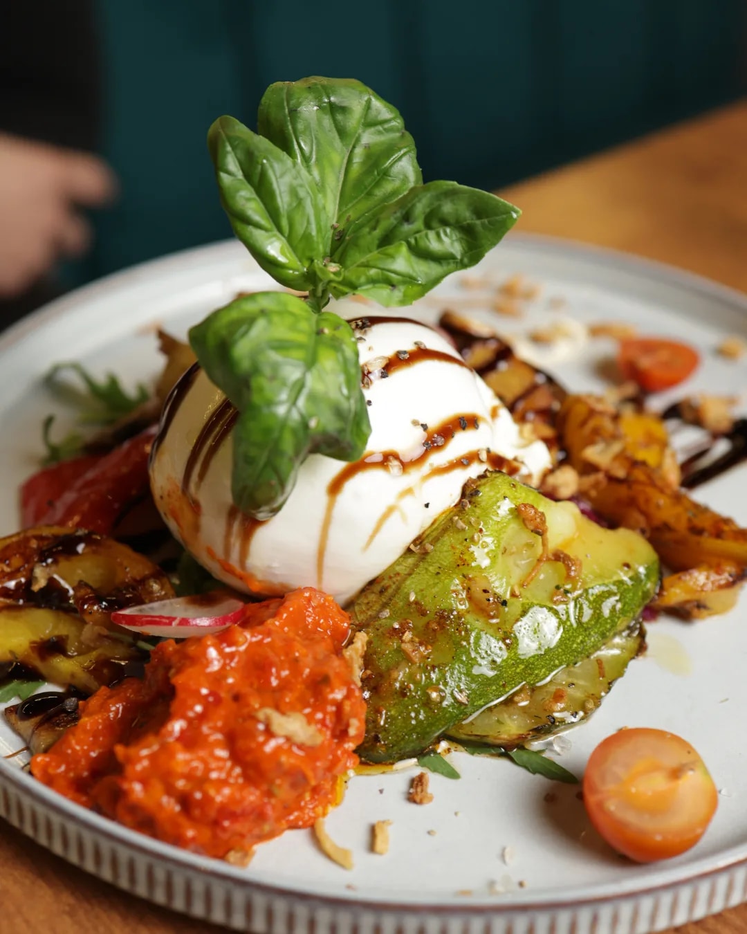
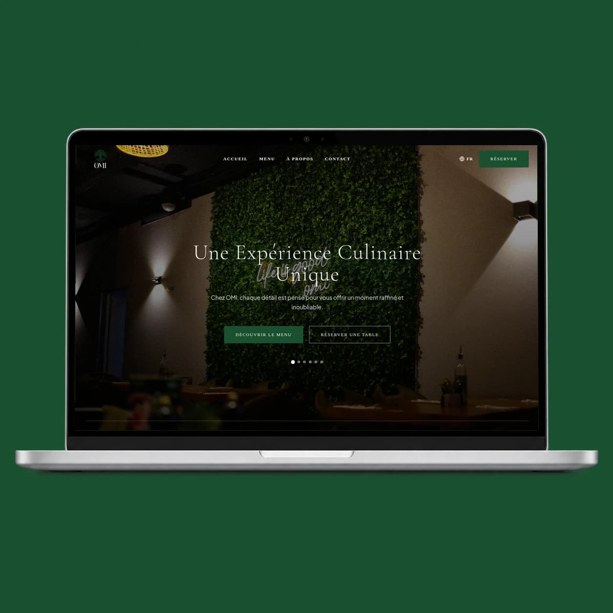
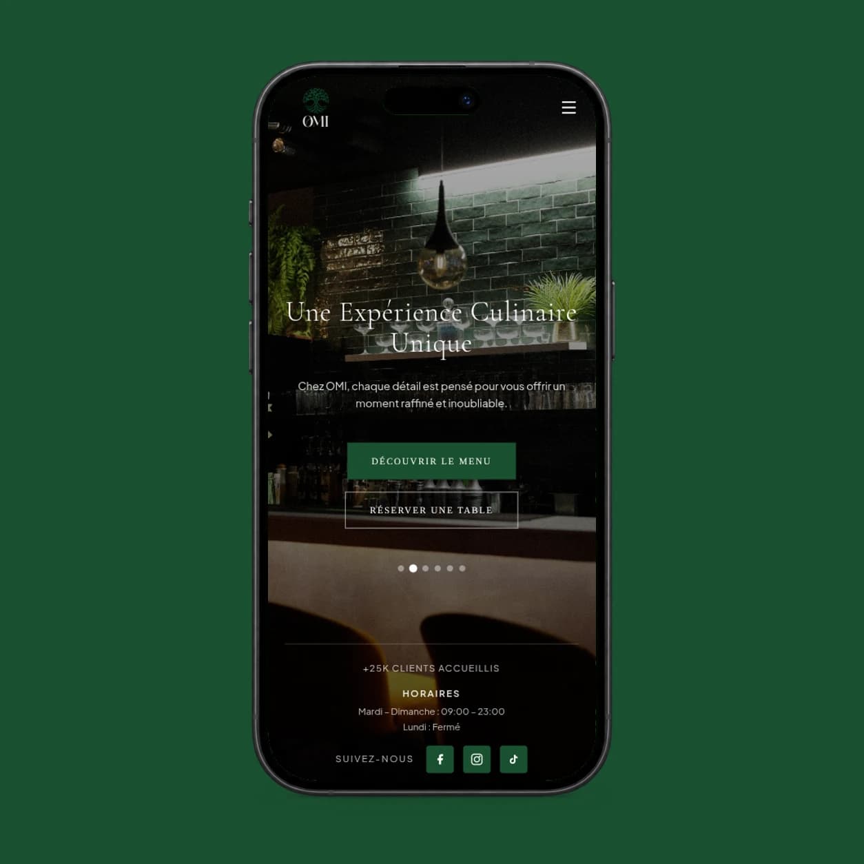
OMI Restaurant / Hospitality / Restaurant
One connected brand, menu, content, and web experience spanning OMI’s visual world, restaurant atmosphere, QR journey, and reservations.
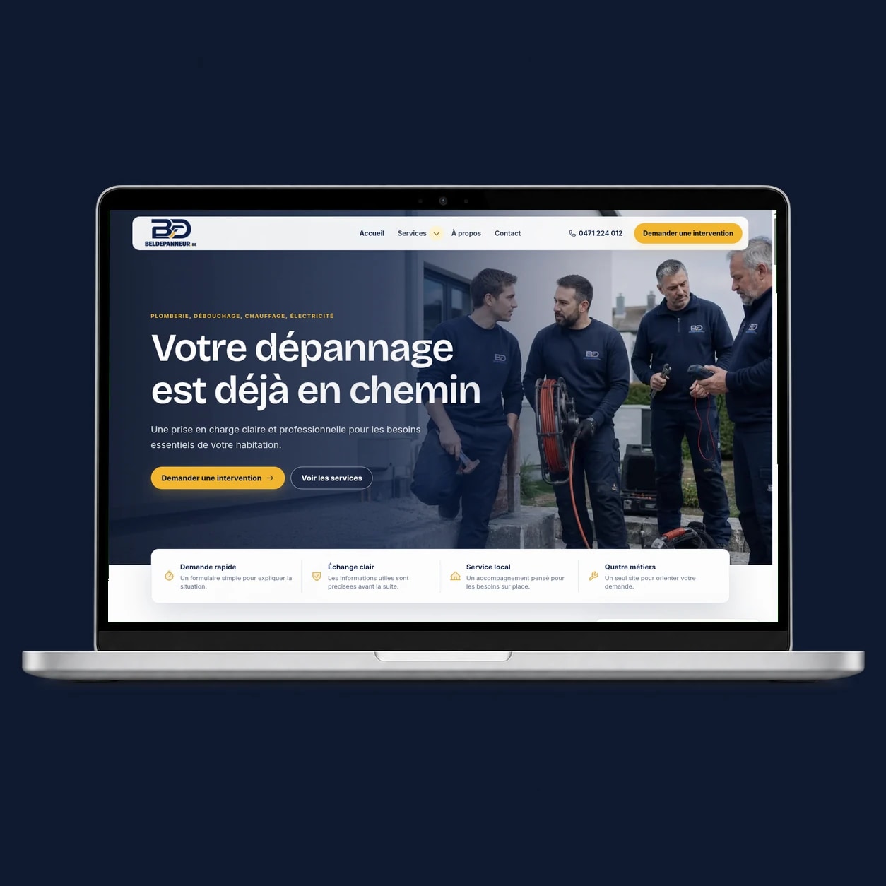
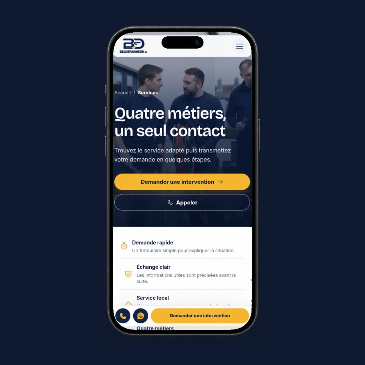
Bel Dépanneur / Local Services / Plumbing
A service-led website designed to make expertise, interventions, and the route to contact immediately clear.

Working together
We begin with the business context, the audience, and the change you need rather than assuming a service is automatically the answer. That reveals whether this is the strongest first move, whether another dependency should come first, or whether several disciplines need to connect.
We explain that reasoning before defining the scope so the investment addresses the underlying problem rather than only its visible symptoms.
Start with Web Design
Make them look, make them choose
Tell us what needs to change, what is already in motion, and what the work needs to unlock. We will respond with a useful next step.
contact@digitalevisibilite.com