
Brand direction
A BOTANICAL IDENTITY SYSTEM.
The supplied reference establishes a botanical visual language through the tree mark, deep green field, warm neutral accents, serif typography, and a subtle repeated foliage pattern.
Hospitality / Restaurant
One connected brand, menu, content, and web experience spanning OMI’s visual world, restaurant atmosphere, QR journey, and reservations.
Client overview
Measurement context / Public Instagram post count / 15 September 2026
OMI is presented as one multi-service engagement rather than separate website and social entries. It includes menu redesign within broader branding and creative direction, content creation, ongoing social-media handling, and web design. The redesigned menu carries the botanical identity into a practical editorial system for the restaurant’s food categories and guest experience.
Inside the work
OMI's visual world appears in more than one place: the printed menu, the website, the mobile journey, and the imagery of the food itself. The design problem was to make those encounters feel connected while keeping each one practical for the moment in which a guest uses it.
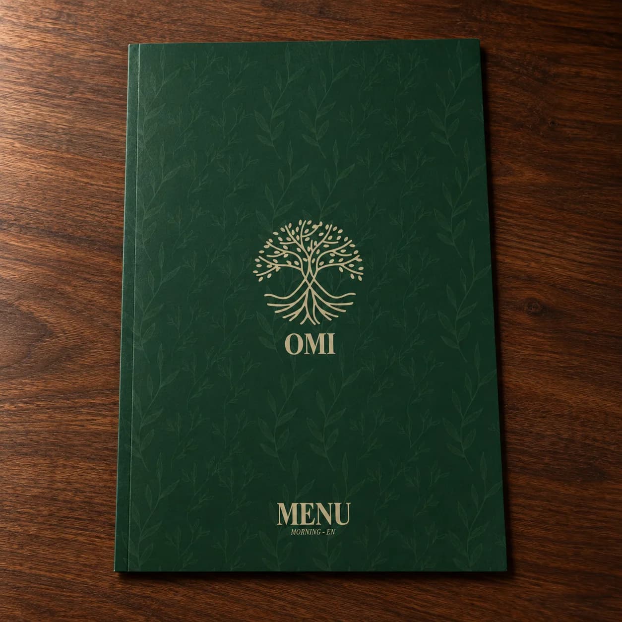
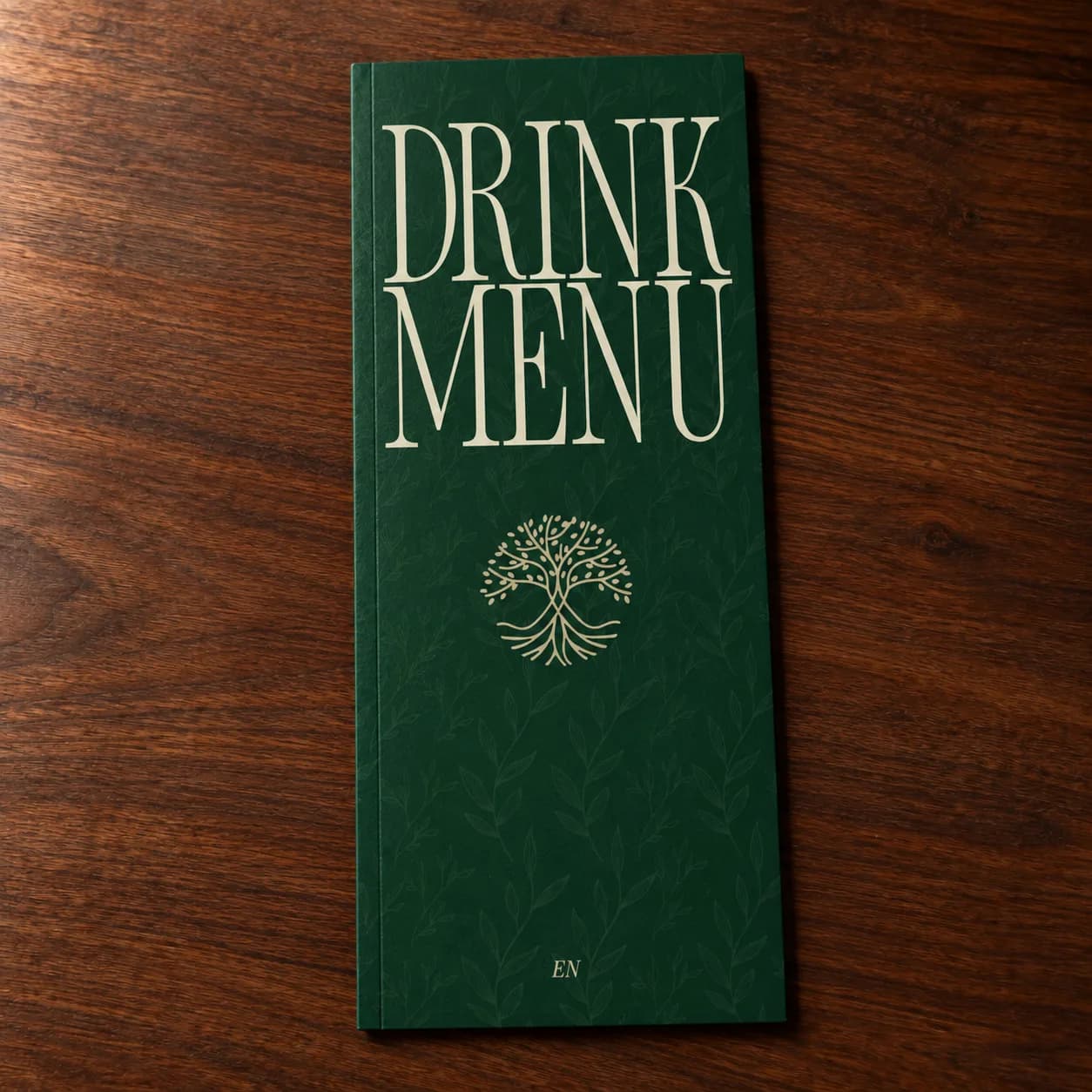
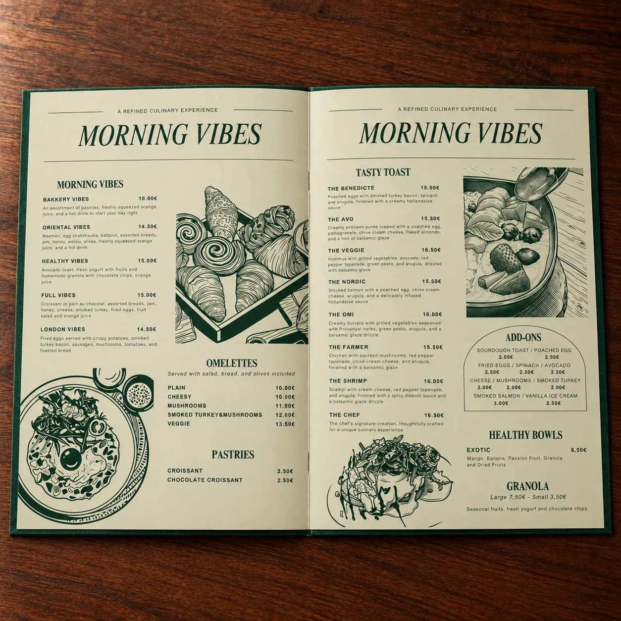
The green cover, tree mark, serif typography, and botanical illustrations establish the restaurant's tone before the menu is opened. Inside, sections, names, prices, and descriptions need a hierarchy that can be scanned at the table. The decorative language works because it supports that reading rather than competing with it.
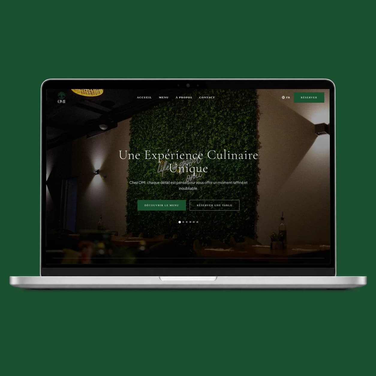
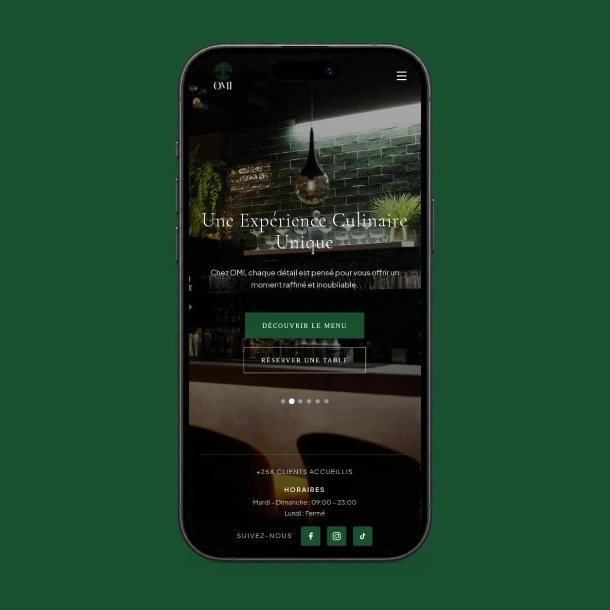
The website first establishes atmosphere, then helps a visitor find the menu, practical details, and reservation route. On mobile, that journey also matters to someone arriving through a QR code inside the restaurant. The responsive views show how the brand remains present while the interface becomes more task-focused.
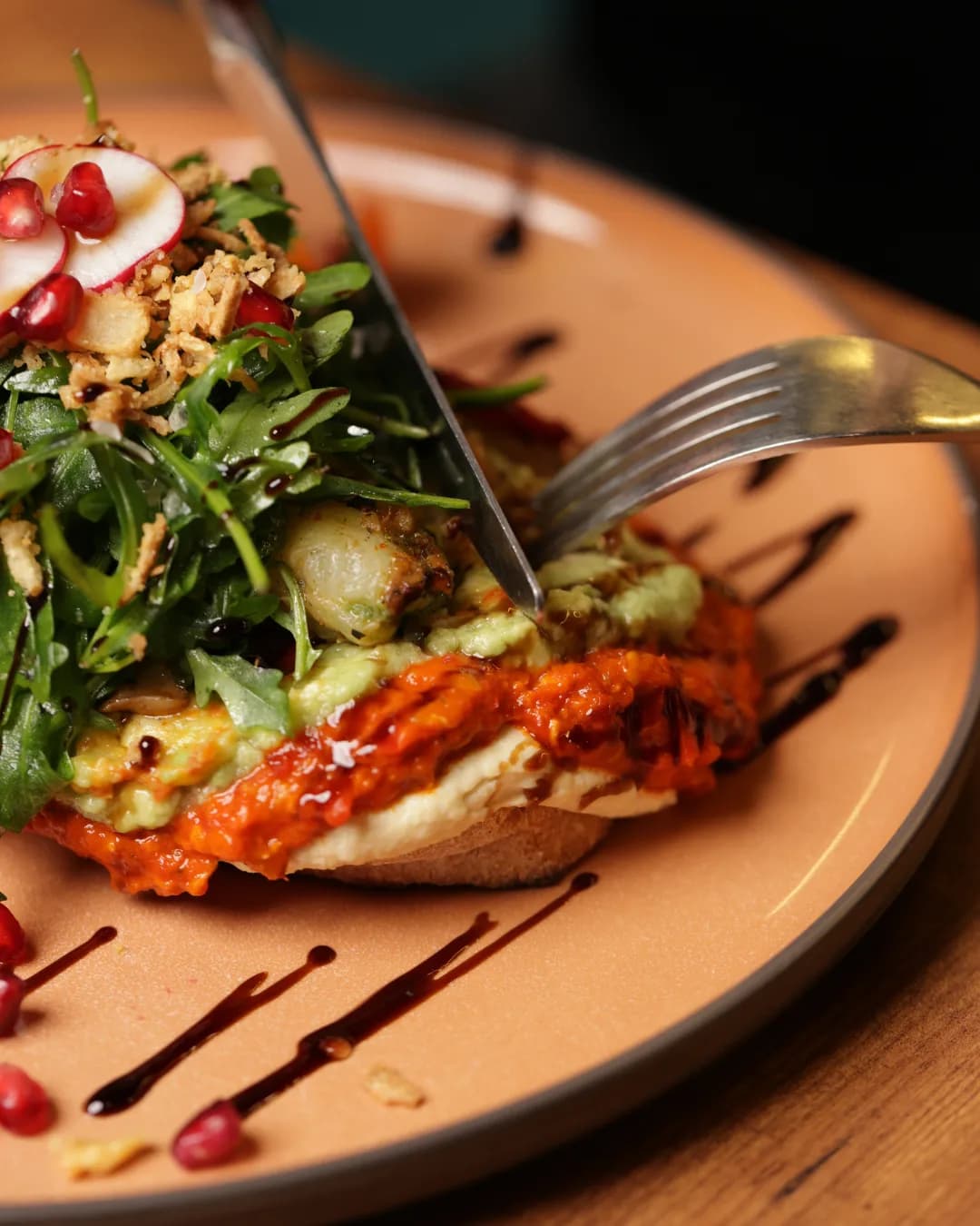
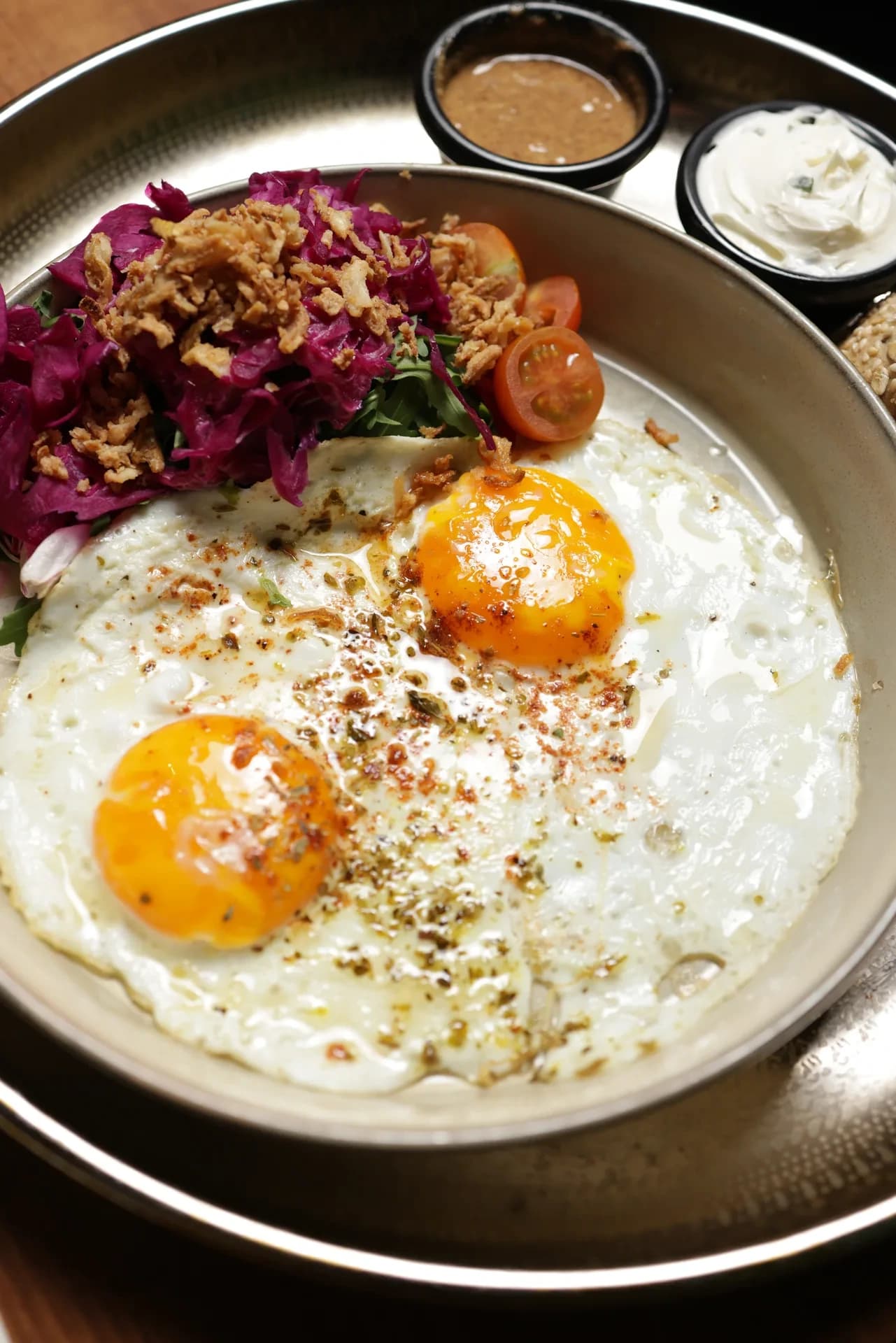
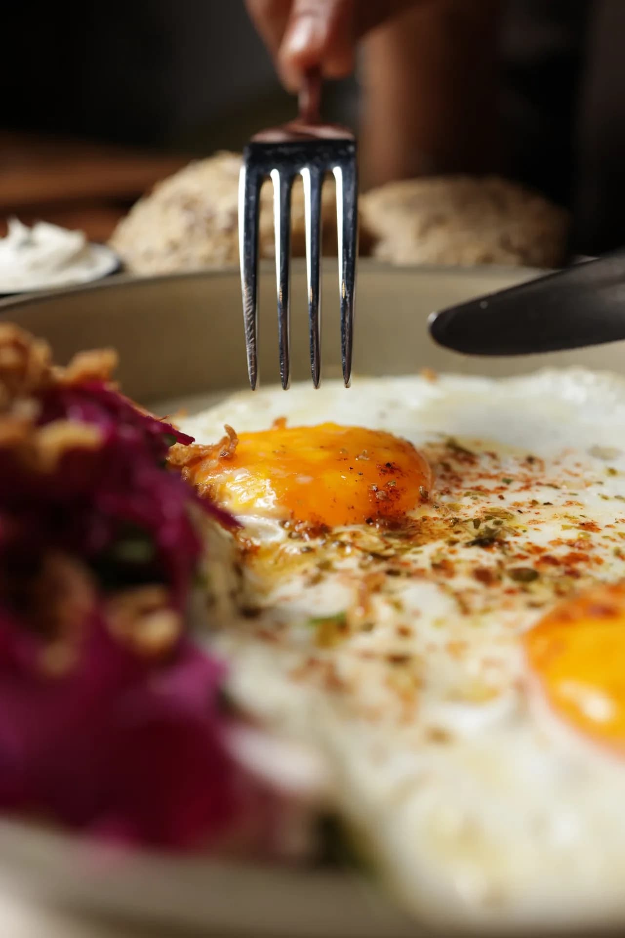
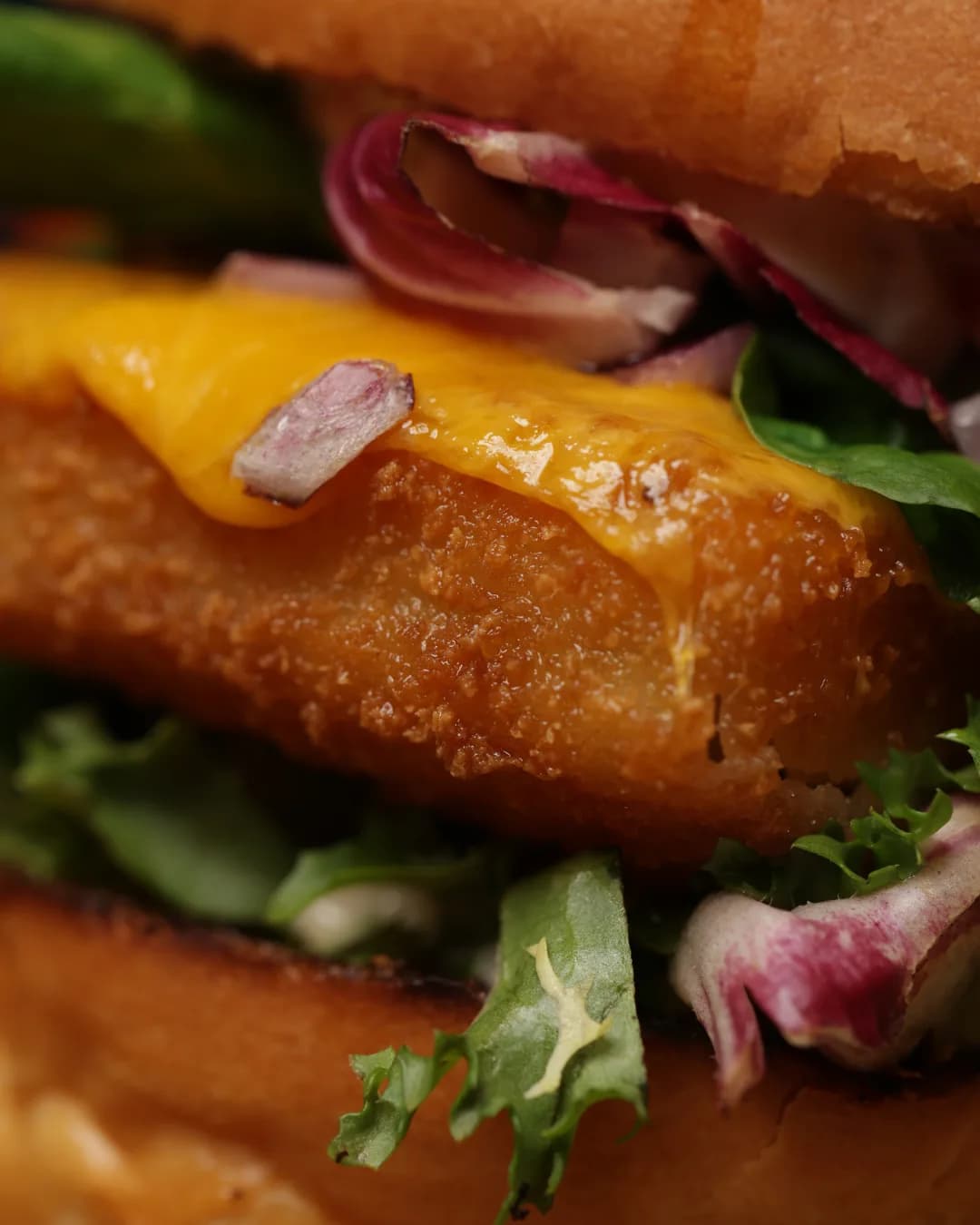
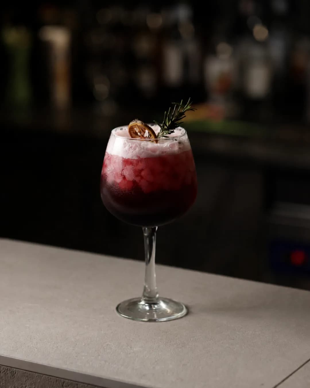
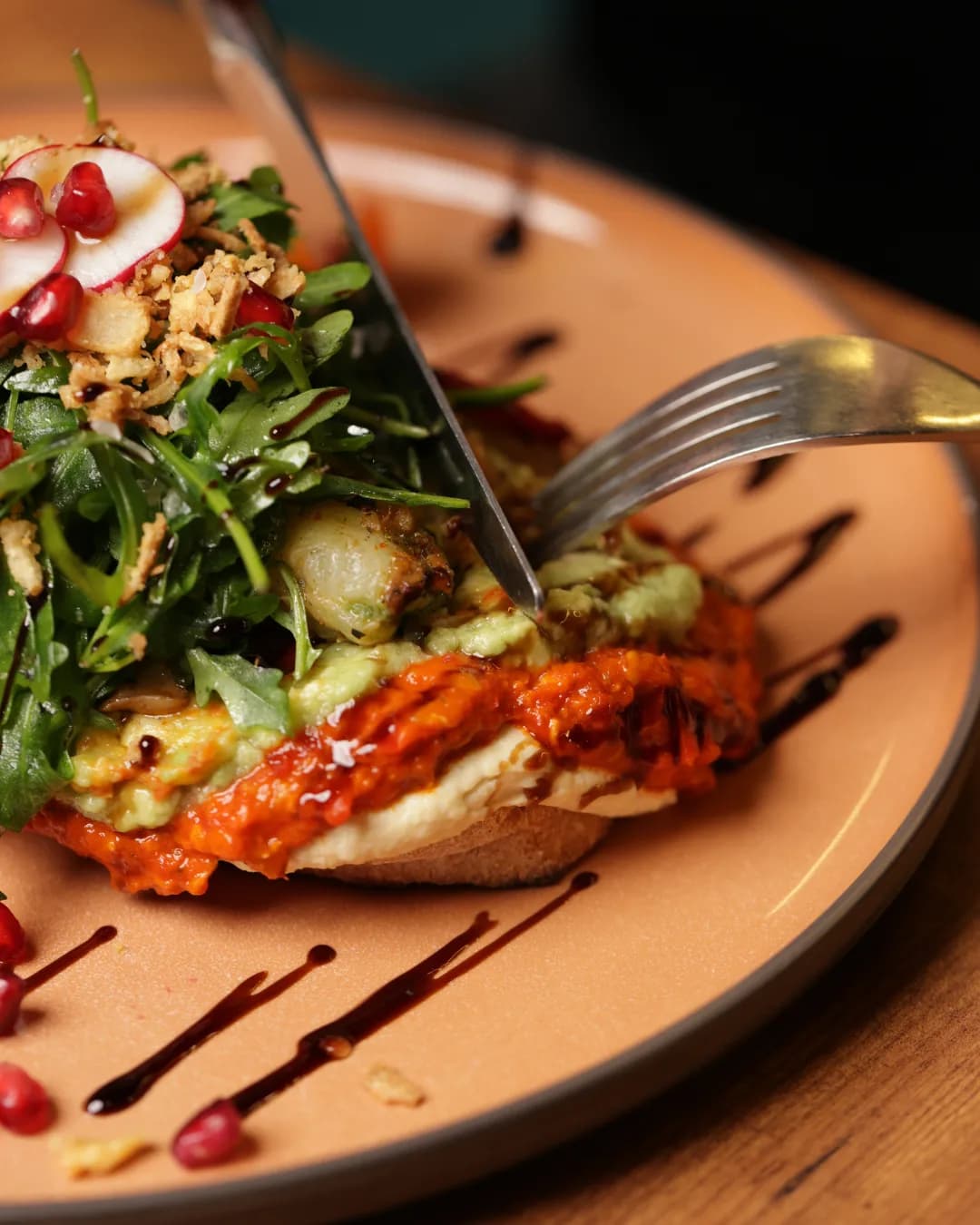
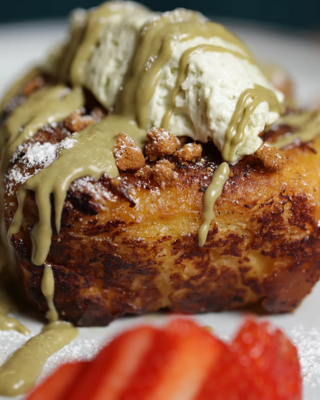
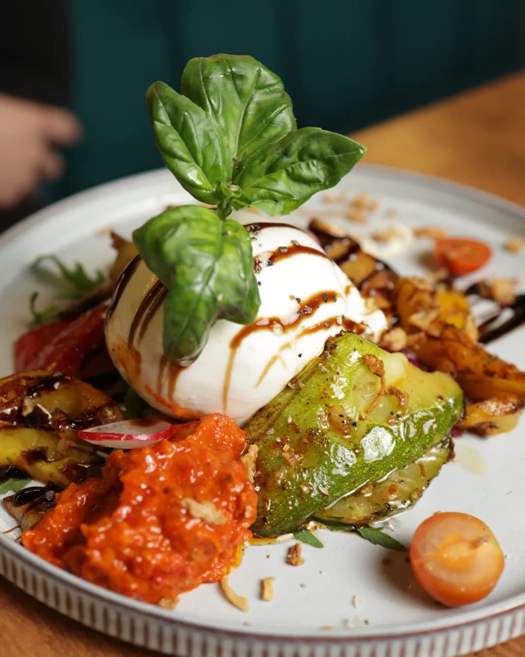
The social library moves between composed plates, close food details, and short preparation sequences. Those images do not replace the menu or the website; they give people another way into the restaurant's world. Their variety keeps the visual story active while the botanical identity provides a stable backdrop.
Creative Direction & Branding
OMI’s menu redesign is an application of the broader branding and creative-direction system, not a separate top-level service.
Brand direction
The supplied reference establishes a botanical visual language through the tree mark, deep green field, warm neutral accents, serif typography, and a subtle repeated foliage pattern.
Menu redesign
The menu redesign translates that visual world into a clear editorial object. Strong section titles, disciplined type hierarchy, aligned names and prices, concise descriptions, generous spacing, and food illustrations organise the offer while preserving OMI’s refined, natural character across cover and interior pages.
Web Design
The responsive website carries the brand system into a clear customer journey. Restaurant imagery establishes atmosphere, the digital and QR menu make practical information accessible, and visible contact and reservation routes move guests from interest to action.
Content Creation and Social Media Management
Creative direction, content production, publishing, account handling, and community management connect the identity to real dishes, people, atmosphere, and recurring formats while allowing each story to remain distinct.
Source and verification
The website work is verified on the live Digitale Visibilité case and client site. Branding and social associations are supplied by the project brief. The public Instagram post count was recorded on 15 September 2026.