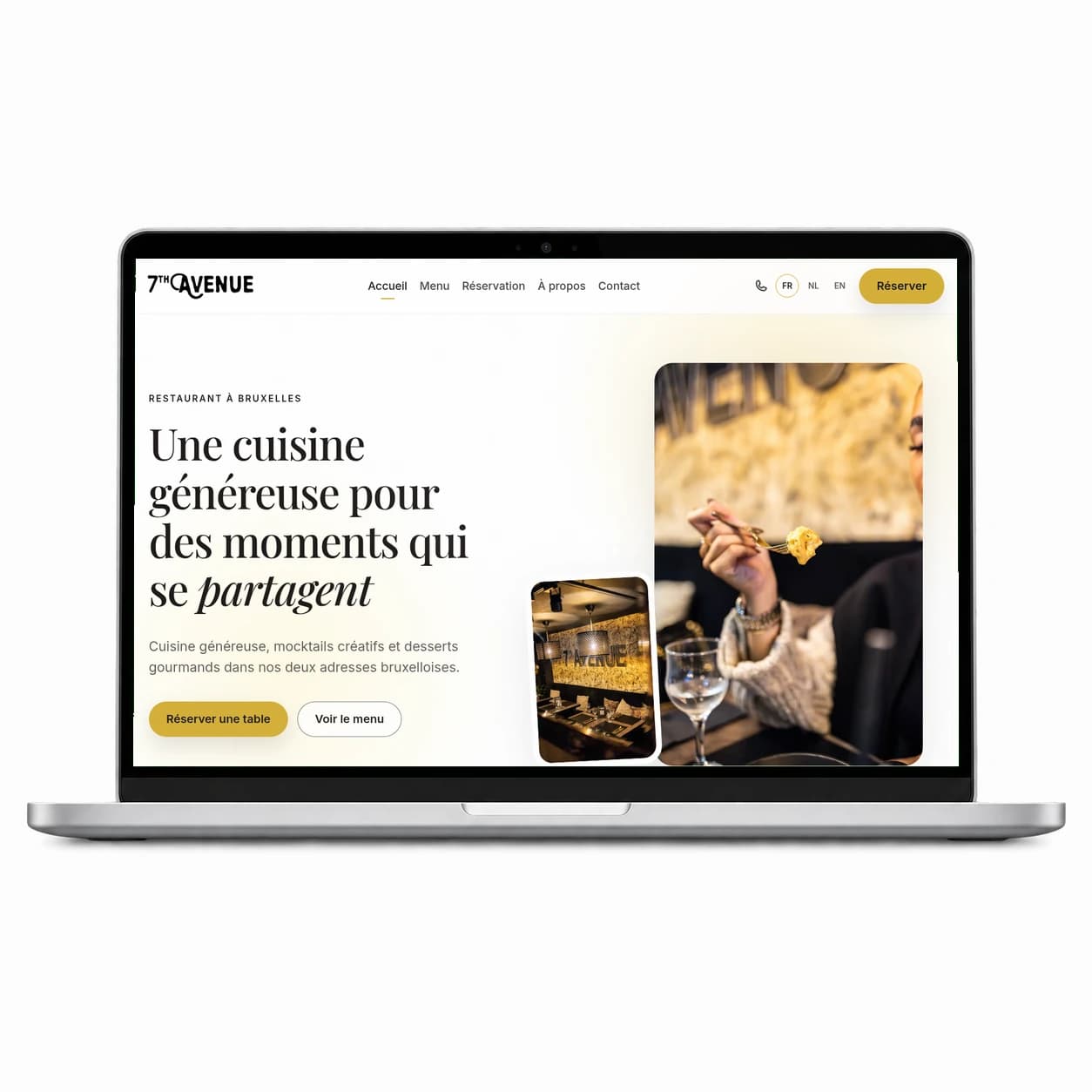
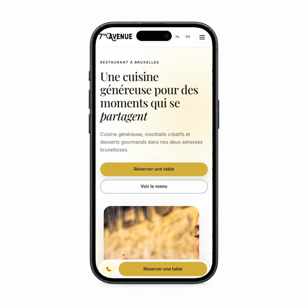
The move from 5th Avenue to 7th Avenue changed the name people would look for, say, and remember. Simply replacing the numeral inside the old mark would have explained the rename, but it would not have given the new identity a considered visual direction. The redesign needed to make the transition clear while keeping enough familiarity for people who already knew the restaurant. That is why the name and lettering were considered together with the mark’s proportions and composition, rather than treating the logo as a single word to edit.
A logo is rarely seen in isolation: it has to sit comfortably beside a menu, on a social post, within a website, and wherever else guests encounter the brand. A more deliberate wordmark gives those applications a common starting point, so the new name reads as part of one identity rather than an isolated graphic update. The intention was continuity with room to grow. The previous mark remains a reference to where the restaurant came from; the new one makes 7th Avenue legible as its own chapter, while the wider creative direction carries that decision into typography, imagery, layout, and content.